Soundbrenner Core
The Soundbrenner Core is a multipurpose musicians tool. It is a combination of a vibrating metronome, contact tuner, decibel meter, watch, and more. This is the second hardware product from Soundbrenner and the one I’ve worked on since the start of the project.
Currently (Sept, 2020) shipped over 100.000 products & NPS score of 40
My main responsibilities:
Research market, define scope of features
Designing the UI of the firmware
Designing the device UX
Writing out the specifications for the firmware engineers
Packaging design (Box, layout, print out materials, manuals etc)
3D visualisations to make better product design decisions + marketing material
Goals of the project:
Make sure the features are worth developing & wanted by users
Make sure the device is easy to use for a wide audience
Ensure the development is cut down into multiple MVP levels
Research and feature prioritisation
Besides a metronome (which was our previous product, the Pulse) we wanted to add additional features into the wearable that are valuable for a lot of musicians and increase the value for users.
Through extensive research on our previous and current audience (App users & Pulse users) we were able to get good insights in what to build.
Vibrating metronome
Our previous product, the Pulse, was a big success and people loved to use the vibrating metronome instead of hearing an annoying clicktrack. Based on user feedback we realised we needed to give users additional on device controls to edit the metronome values.
Contact tuner
Our product needs to be unique into a competitive but non progressive market. We noticed from our app user base and previous product (Pulse) that sting instruments where a big portion of our users. A problem detected through surveys and interviews was that guitarist always need to bring all their accessories to be able to perform. This includes bringing their clip-on tuner. With Core, your tuner is always with you on your wrist.
Decibel meter
A musicians most valuable asset is their ears. Losing your hearing is obviously devastating for a musicians to be able to enjoy music and to play music. We decided to build in a decibel meter that also passively detect if your ears are exposed to loud decibels for x time. This to give a warning to protect those precious ears. Some critical points of consideration:
How quickly does the alarm go off
Do you receive these alerts when u perform or play or not
“Fun fact: After we released this feature with our hardware product (Core), apple launched a decibel feature in their apple watch.”
UX flow and usability testing
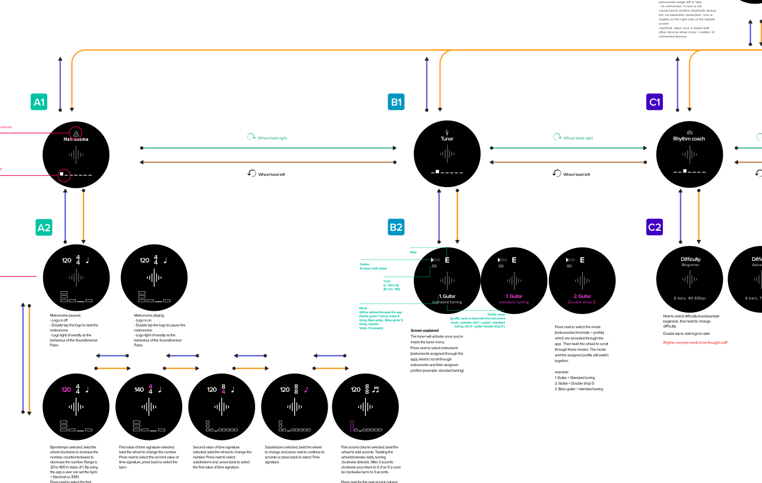
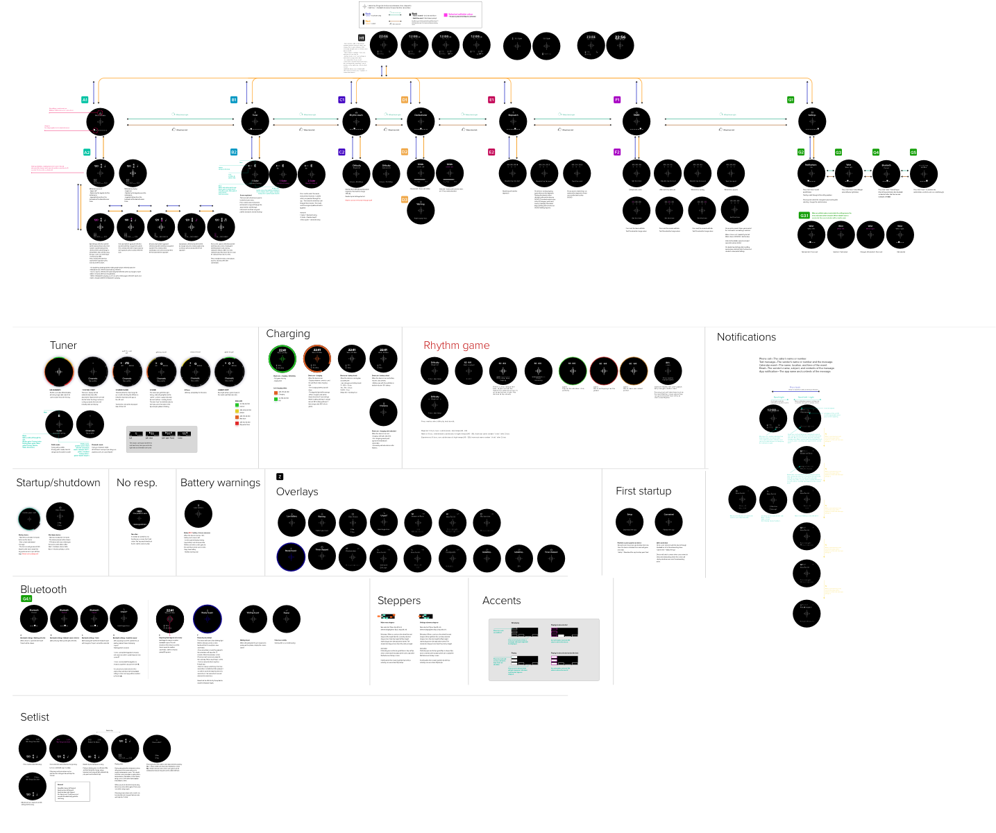
Small sample of the designed userflows and interactions. The complete flow has over 400 screens.
After numerous iterations of Flow and UI designs I needed to test if my assumptions would work. The User experience and UI flow are based on the hardware design by RND. I was limited to make use of 4 control elements on the Core which was quite the challenge, which are:
The rotating wheel
Button 1 (big)
Button 2 (small)
Touch sensor on screen (logo)
One of the earliest hardware mockups. At this stage the overall design was decided which gave me the limitations/options of controls mentioned in bullet points above.
Usability testing & prototyping
Since there is no product produced yet, and we cannot create interactive prototypes like you would for an app, I had to improvise to be able to usability test the flow. I made a huge print file of the whole flow, including all the screen special states, and printed it out in the same physical dimensions that our device will have.
The first version of the prototype. More adjustments where needed & it would be better if the prototype screens where black to more closely resemble an actual screen.
Because it’s a unique product and a hardware product, I had to improvise to create a workable prototype for usability testing.
All test participants where musicians, playing a various amount of different instruments, and of different age groups. I tested the flow for:
Usability errors (Numbers)
Success rate of task completion (%)
Time on task (Min)
Conclusions from usability testing:
We needed to make sure it’s clear in onboarding users know how to physically place the Core onto a string instrument to tune.
The tuner UI needed more ‘Guiding’ elements to pinpoint when a string is ‘in-tune’.
Editing values seemed troublesome ate the first task, but when completed, the task completion was near perfect as the whole UI and its features are very consistent. A user can apply the same order of actions on all features.
Final UI design for Core
There where a couple of limitations for the Core’s UI design:
Firmware not software
2 lcd screens of 32px x 96px
This brings some constraints as:
The UI has to be very limited and minimal.
There’s not much screen estate.
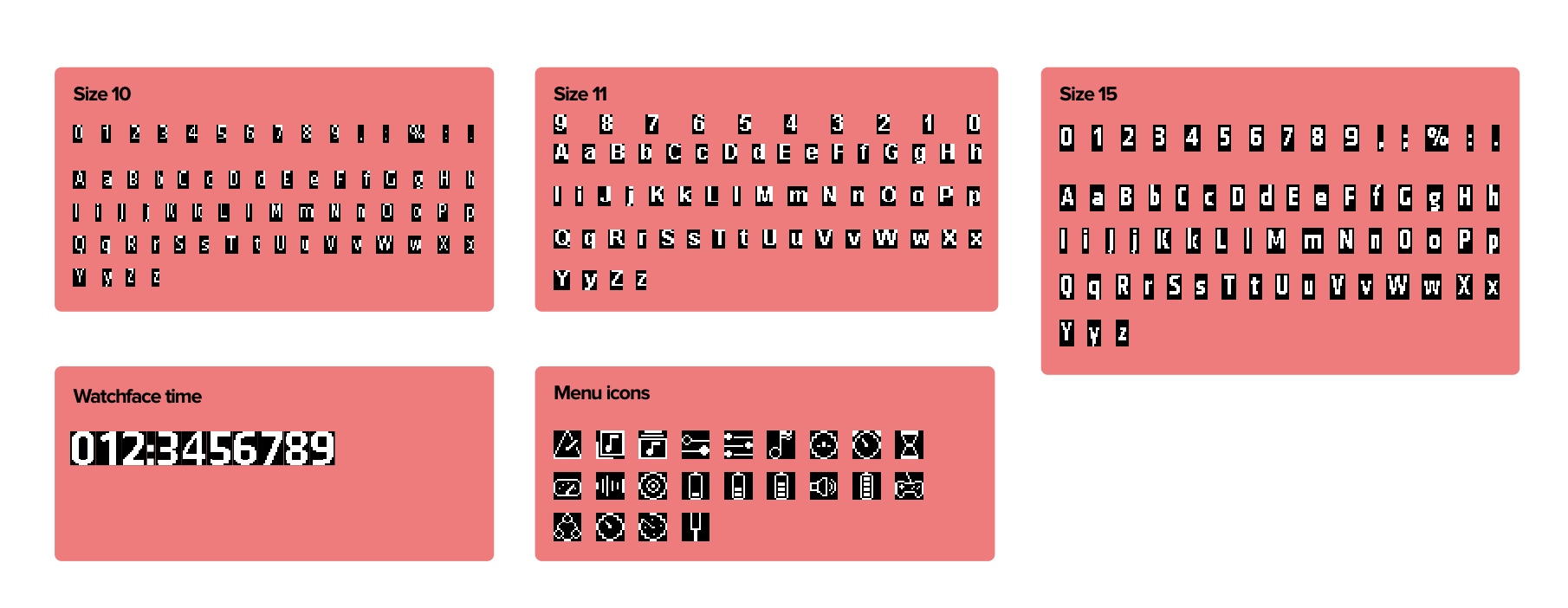
The UI and icons need to be pixel based.
Experimentation with typeface and icon sizes for our pixel displays.
The whole flow of Core
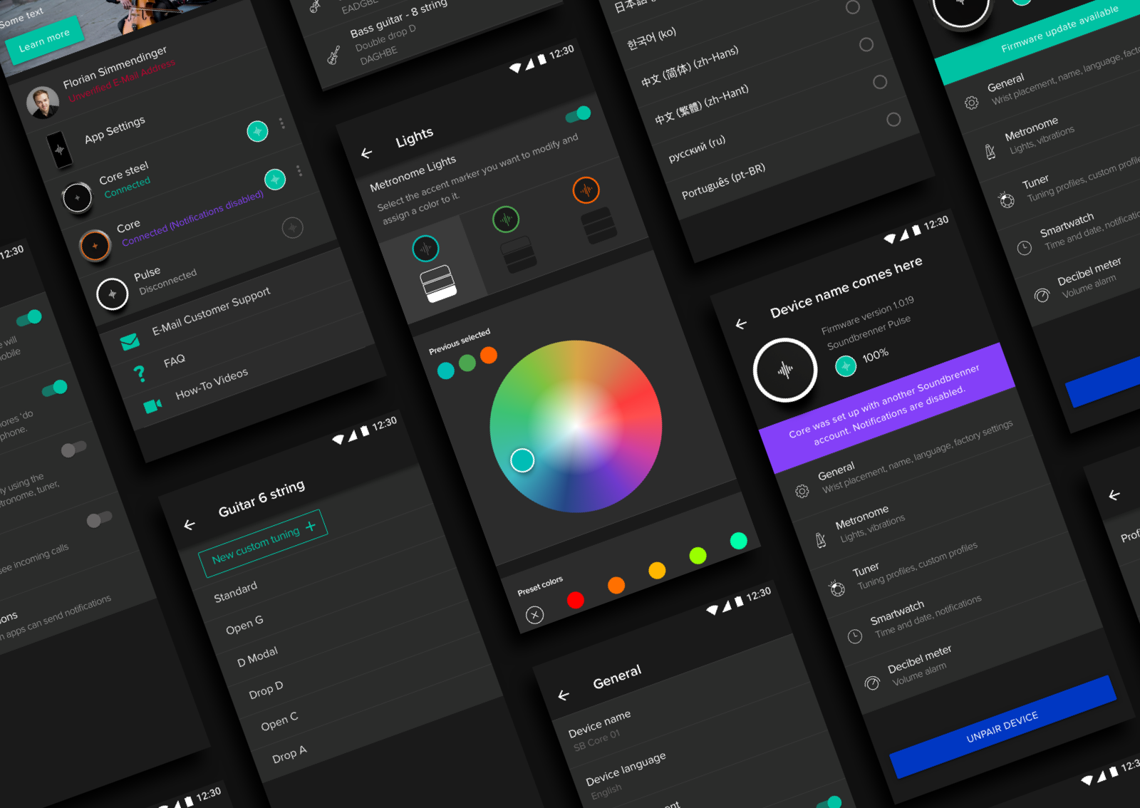
App device settings
The Soundbrenner Core needs to be configured through our metronome app This unlocks additional features to customise the product like:
Lights
Vibrations / haptics strength
Naming of device
Updating the firmware
Clocks / date settings
Notifications settings
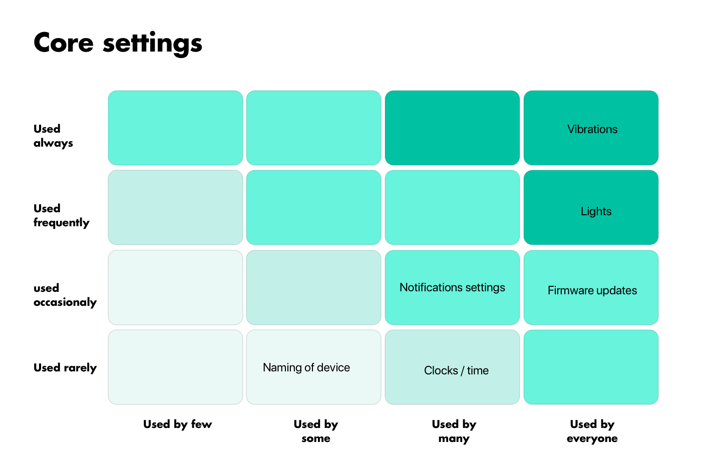
Using the red routes technique (what features get used how often x by how many people) is determined what settings where more often used and more valuable to establish an order in the settings.
Red route map of important Core settings
Using Sketch’s quick prototyping tool we where able to communicate the settings easily to development.
Overview of designed settings for the Core both platforms (Android in image)
App onboarding flow for Core
The first time product onboarding is absolutely critical for us. It was very important that the first time usage of our product was a smooth experience and that users understood how the product worked as quickly as possible. As this will define our:
NPS score
Reviews
Complaints and returns
Future wearable sales
Goals of onboarding:
Explain how to use the product
Setup the Core with vital information to provide a user with e great user experience. This includes what wrist to wear (defines UI rotation), decibel alarm & notification settings.
A user is able to comfortably use the product straight after the onboarding.
After numerous flow drafts for the Core onboarding I made a fully working interactive prototype which we used for usability testing the app in combination with the Core. Try it out below.
Packaging
Quick summary of the packaging process. From die-line creation, visual concepts, to final production packaging.
Compared dozens of wearable packagings
Early stage prototype from the factory
Defining the layout
Last sample before production
Last rendered impression
Conclusion
This is a very summarised report of the work done on Core. The research, design and development has taken roughly 1,5 years. This was a whole different project for me then usually, as it involved specialised hardware.
Currently (Sept, 2020) shipped over 100.000 products & 700.000 app users.
