Ecommerce webdesign - Soundbrenner
I created the new Soundbrenner website (UX/UI + Visuals) from start to finish. This involved months of work and is currently online at www.soundbrenner.com
Below you can checkout the interactive mockup I made for one of the product pages and play around with it.
Research phase
To kickoff the project I analysed the following:
Old existing website
What was on it (products), how did it perform (analytics), information hierarchy
New upcoming products
Needs and demands from stakeholders (Marketing, Design, web development)
I started to take all this information and create categories and labels of everything that needs to be housed on the new website.

Categorising all elements needed for the page.
To get a sense of our audience, and to optimise the new website information hierarchy for optimised usability, I performed a card sort with previously established labels. A card sort works by letting users combine labels which they think belong together. This way you can determine how information should be structured on your website.
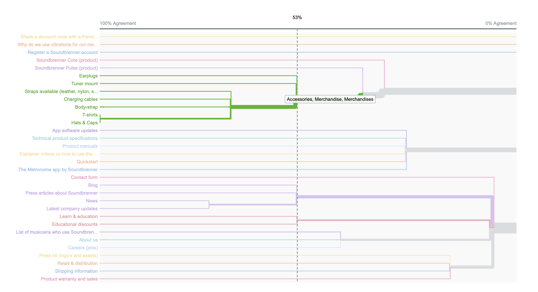
Card sort results in grouping of information in a dendrogram.
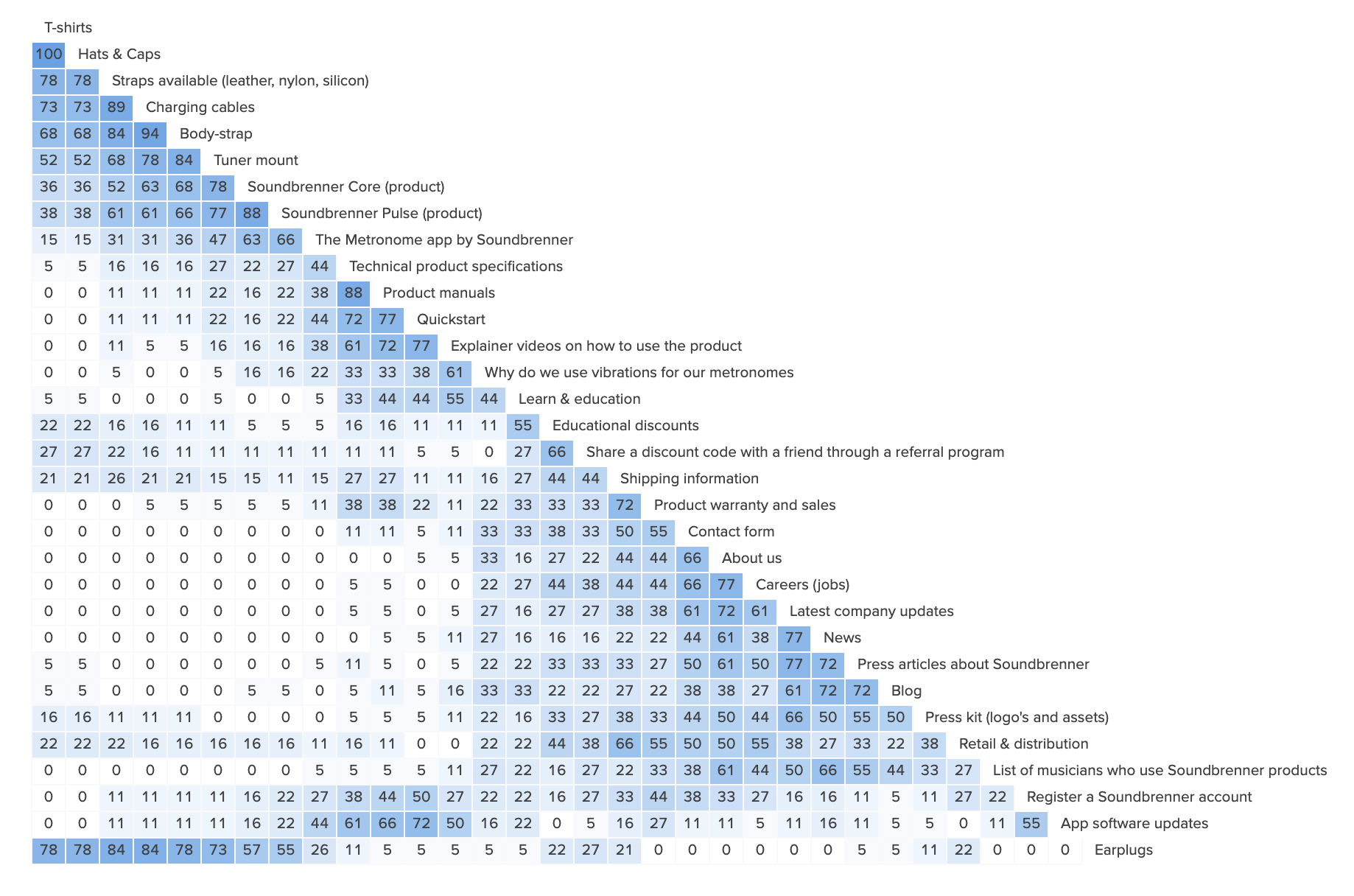
Card sort results in grouping of information in a similarity matrix.
Information hierarchy
Using the information gathered from research, I drafted an initial hierarchy for the website.

First hierarchy draft.
Now that I drafted this IA I can use this structure to to a tree-jack. This will determine if my proposed structure and navigation will lead people to what they are looking for. Now the final information hierarchy and navigation structure can be decided.


Small sample view of one of the results from the three-jack.
Wireframing
Based on the research and IA, I started drafting out the initial wireframes.
Initial UI Design
Comparison page
From several surveys and usability tests we found out that it’s not yet clear what the difference between our products where and how they stack up to one another. Therefor I created an comparison page that shows of the difference between Pulse, Core & Core Steel.
Mobile
Since mobile screens are narrow, I created and prototyped a comparison table utilising scroll movement and selectors (for the affordance of scroll). This turned out to works really well!


Conclusion
To check out the current up to date website visit: www.soundbrenner.com