In app sign up process
(E-mail gathering)
The metronome app by Soundbrenner always had a signup and login feature as this is required to successfully register the Soundbrenner wearables (Pulse & Core). Soundbrenner also gathers information about the user which we can utilise to get to know the customer better through data gathering in mixpanel.
Problem
People would only signup once they’ve purchased a wearable. This means that we have a lot of app users without a wearable, that we do not have information on.
There’s a large amount of users that we cannot currently target and reach with email drip campaigns to sell our products.
Ideal solution
We increase the amount of users that signup in our app (non wearable users) so we have more data on our users.
We can send those newly signed up users into a email drip campaign to sell more wearables.
The UX (UI) flow.
Before designing the new signup flow I’ve set some goals and confinements:
Our first use drop off must not increase by more than 10%
Users must see the value of the app, before using the app to increase signup conversion
Utilise our current social proof (User base, app store position, wearables)
Socials proof and app value impression on first use.
I decided to create a quick animation of our wearables to create a wow effect in the beginning. Then quickly show how many musicians worldwide already use and love our app. The goal of this is to give a users a quick impression of the Soundbrenner company and ecosystem of hardware and software.

Next I decided to show a couple of our in-app features through screenshots with added value copy. Now first time app downloaders know the company and can see what value the app provides for them without having used the app so far.
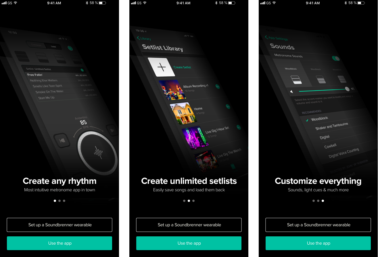
Slideshow displaying our in-app features.
Signup screen
On the signup screen I decided on 2 main buttons, one being the signup which has more emphasis, and one less obvious skip button. This is to ensure a user knows this is the signup screen + that’s the button to press to actually signup.
The Skip button is still clearly present and not put into a little corner to prevent a huge increase in potential drop off.

Signup/Login screens sample.
Conclusion
After the first weeks on launch we could asses the baseline performance.
The drop off was 8% (less than the 10% limit I defined)
5% of users signed up on first app open
Hopefully in a few weeks we can establish if this increase in dropoff vs increase signups and email gathering, will also increase our wearables sales.

The final UI flow