iOS & Android | Safeguard
Safeguard is a application & dashboard system for emergency response employees within a company. It allows for a quick response in case of an emergency and it automatically detects the presence of employees. Companies can use Safeguard to manage their response teams more efficiently and prevent dangerous situations. If an employee enters their work environment the system detects him/her and makes him/her available to respond in an emergency.
Safeguard is a product made and owned by app company Digitalisma. During my time at Digitalisma I had the pleasure of improving the system over time. This is just s small insight in my work process.
Process
For most of my projects you can break down my design process in 5 main stages. It’s an iterative process in where I research and understand the product, stakeholders & the users needs & goals and transform those effectively into products.
Heuristic evaluation
To effectively improve the old Safeguard dashboard to make it more user friendly I started out with an Heuristic evaluation. I follow the Heuristic evaluation method developed by Jakob Nielsson. “Jakob Nielsen’s 10 general principles for interaction design. They are called “heuristics” because they are broad rules of thumb and not specific usability guidelines”. For my heuristic evaluations is make use of Airtable, in which I made a heuristic evaluation template which I can easily use to document my findings. Below are some examples of the Heuristic evaluation findings observed in the old dashboard system.

A small overview of issues found by using the 10 heuristic laws.

Heuristic violated: error prevention, priority 4 “ logout button is next to the most important feature & button. This button is used to send a call to the emergency response employees”
Heuristic violated: User freedom, priority 3 “There are times when users cannot go back a step so they are either stuck in the interface or have to go back 2 steps”
Result
Using this method I can methodologically analyse a system for heuristic interface issues. I write down the problem, which heuristic is violated, where it happens & how to solve it. To see the full evaluation click on the link. https://airtable.com/shrzYtc135HaKaFNj
User research
Of course we constantly learned new things about our users which were already using our system and provided valuable feedback. To learn even more about the users of Safeguard I’ve conducted observations, interviews and surveys. Having this information I can redesign the dashboard based on facts and research, and not on assumptions.
From what I know about the Safeguard users I’ve made 3 persona’s representing our 3 different kind of users. There’s the:
Head of the emergency response team.
The emergency response employees.
The reception/control centre.
Contextual inquiries.
Based on the Heuristic evaluation I needed to see if there were any other usability issues. Or that we could present information differently to better suit the needs of our users. In order to see what the user wants and needs I performed a contextual inquiry with John - Head of the emergency response system.
While being on location in his working environment I asked him about his average day
and how he used the system and why. In order to get valuable and true data it’s important that I can actually see and observe his methods. “It’s not what people say, it’s what people do”.

Persona could be concluded to three.
Problem 1: Unnecessary details.
The version numbers and all other details about the installs, user version, phone data etc are not important to Marcel. He doesn’t know what to do with that and it doesn’t matter to him. What he actually wants to see is: Is their app working correctly? and if not how can I fix it?
User goal: As the head of the emergency response team, I want to know if the app is working correctly at my employees because I need them be to ready for an emergency at all times.
Problem 2: Unclear view of app users.
Marcel has a hard time to find and track specific users in the current dashboard. He was more than 100 employees in the system in a long list. Every list item is expandable to see if the user has successfully downloaded the app and is an active user. This means that it takes forever for him to notice: - if something is wrong - does my employee run safeguard - is it working.
User goal: Marcel needs a way to differentiate between invited users and active Safeguard users and make this data easily accessible and clear.

Fast paced sketching for various solutions with pencil & paper for quick concepting and finding the best solutions for the problem at hand.
Problem 1: Designed solution
To anticipate on his needs I’ve made life easier for him through adding the feature that Safeguard automatically send a push notification if there’s a problem with some of the user’s settings.
Problem 2: Designed solution
Based on Marcels needs I’ve made 2 separate columns. The left column showing all active users with the date they’ve become active (the moment they went from invited to installed), their status and the option to see more details. The right column showing the people that have been send an invite, but have not installed the app. The people can be easily sorted by name, status and date active.


App research & improvements
Surveys.
To determine the overall image of the Safeguard application, I’v send a survey to all app users. The things I needed to uncover where:
- Does the user know what the app is for?
- Does the user know how it works?
- How does the user feel about the product?
- What issues do they have?
- What is the distribution of Android, Windows and Iphone users?
- What settings on their phone do they usually turn on or off and why?
- Does the user understand the current onboarding? why not?
One of the most surprising data was: 35,4%
of the app users thought that Safeguard was continuously tracking their locations even when they were not at work. At least 30% of those users preferred not to use the app because of their privacy.
This means that it was unclear to users how the system works. Yes safeguard does track your location to see if you are at work or not at work. However, Safeguard never keeps and shares your location details outside the work perimeter. Knowing the users, I decided to redesign the onboarding for the application.
Onboarding redesign app (storytelling)
In order for the users to completely understand how the system works and that they don’t need to worry about their privacy we need to tell them a story. Storytelling is one of the most effective ways to communicate. Who doesn’t like a good story right? The story doesn’t need to be complicated. What matters is that the user can recognise him/herself in the story and therefore understand the information we give them.
How not to:
There’s no reason to get technical. We shouldn’t tell the user that if their gps is on we can track if they get in our geofence (our perimeter to track if they are at work or not). Our users are not on the same level of technical expertise as us, so we should not expect them to be either.
The right way:
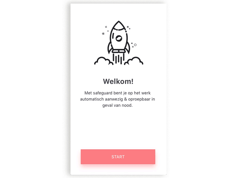
Instead we tell them a short story, the image below is the flow of the final onboarding:
Result:
Only 5% of the app users believed that Safeguard was tracking them all the time. Thats 30,4% less than before this onboarding.
The animated onboarding & copywriting for Safeguard
Outcome & achievements
Improved overall accesibility and usability
Better user experience of dashboard & app
Better tone of voice of the platform measured by surveys and feedback
Safeguard is now the Netherlands biggest safety report system and used by the dutch government.